Need training at your office? Request a quote for custom training.
Adobe FrameMaker: Aligning Text Across Columns, Part I of II
By Barb Binder
Students come to my page layout classes (FrameMaker & InDesign) and often ask how they can easily line up baselines across columns, and easily force the last lines of every column to line up with the bottom margin. The word easily is often a clue to their pain: it always means they are adding and subtracting leading and paragraph spacing values to achieve their goals. Might be OK if there aren’t going to be any further edits, but if there are, it becomes a total nightmare.
We have three techniques in FrameMaker to automatically align text in the columns of a multi-column layout so that text has an even appearance:
- Balancing text across columns. FrameMaker distributes text evenly across the columns of a text frame that isn’t full of text such as the last page of a chapter.
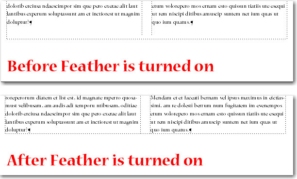
- Feathering text to the bottom of text frames. Also known as vertical justification, which means that the last line of text in each column reaches the bottom of the column.
- Synchronizing baselines across columns. The first lines of body paragraphs line up whenever they appear side by side in columns.
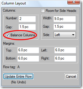
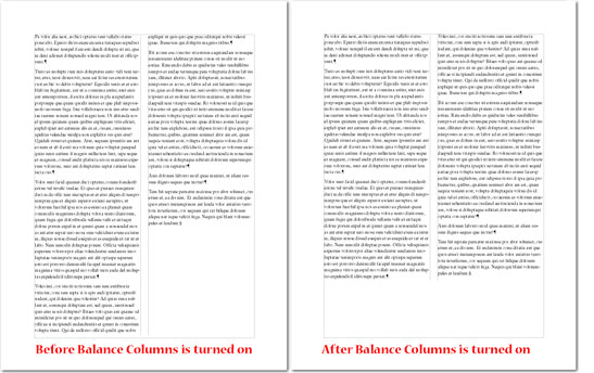
Balancing text across columns. The first one is the easiest: in a multi-column layout, just place your cursor in Flow A (or the main text flow) and chose Format > Page Layout > Column Layout. Select Balance Columns and click Update Entire Flow. The results are most evident on the final page of the flow: instead of having one long and one short (or empty) column, you will end up with columns that end at the same place.

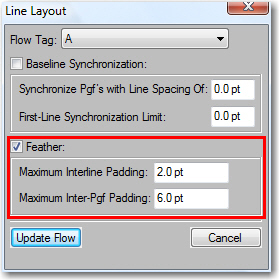
Feathering text to the bottom of text frames. To force all columns to end even with the bottom margin on each page, you can turn on feathering. You specify the maximum amount of space to be added between paragraphs (Interline Padding) and within paragraphs (Inter-Pgf Padding). The space is added first between the paragraphs, and if that doesn’t do the trick, it will add the space within the paragraphs.
- If a document window is active, place the insertion point in the main text flow.
- Choose Format > Page Layout > Line Layout.
- Select Feather, and enter the maximum amount of space FrameMaker can add between lines (Interline Padding) and between paragraphs (Inter-Pgf Padding). FrameMaker won’t exceed the padding limits you set. I’m using the fairly conservative default values of inter-line padding of 2 pts, and maximum inter-paragraph padding of 6 pts.

- Click Update Flow.
If it’s not possible to feather text in a column without exceeding the limits, FrameMaker does not even try to feather text in that column, which is great for the last page in the flow that most likely should end short.
If you’d like to learn about the third option of aligning text across columns in FrameMaker, continue on to Adobe FrameMaker: Aligning Text Across Columns, Part II of II.


One thought on “Adobe FrameMaker: Aligning Text Across Columns, Part I of II”