Need training at your office? Request a quote for custom training.
Adobe FrameMaker: Understanding Paragraph Indents
by Barb Binder
Indents in Adobe FrameMaker are pretty straightforward. When you decide that you would like to add indents to a paragraph (i.e., a block quote), you simply select that paragraph and enter your First, Left and/or Right indent values into the first column of the Basic property sheet in the Paragraph Designer.
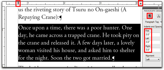
As a visual learner, I’ve become accustomed to keeping an eye on the rulers while I’m working. A paragraph without any indents looks like the image below. Note the zero values in Paragraph Designer on the right, but also the position of the First/Left indent triangles and the Right indent triangle in the ruler. They point directly down to the edges of the paragraph.
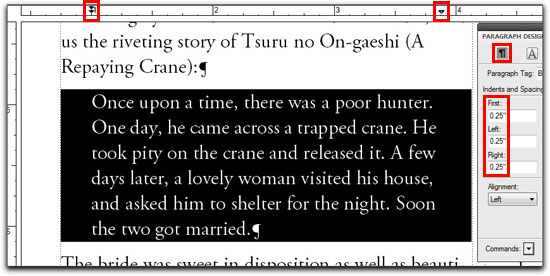
A paragraph with First, Left and Right indents defined might look like this second image. Note the .25” values in the Paragraph Designer, but also the new positions of the First/Left indent triangles and the Right indent triangle in the ruler. They’ve shifted in to reflect the indents.
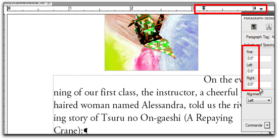
So why would a paragraph without an indent value specified look like this in the ruler?
That question was posed to me last week by a former Advanced Adobe FrameMaker 9/10 student. Turns out the answer has nothing to do with indents, and everything to do with Runaround Properties. He had a graphic sitting on the same page, just above the paragraph in question. Even though the graphic wasn’t touching the text, the Gap value did, and it resulted in a very odd display.
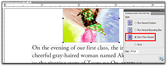
On a page-anchored graphic (that is, sitting on the page and not inside an anchored frame), Runaround Properties is set to Run Around Bounding Box as a default. Once we turned it off with Object > Runaround Properties > Don’t Run Around, the paragraph moved back to where it was supposed to be.


Thanks, Barb. This is one of those gotchas that would have driven me crazy. Perfectly reasonable once you understand it 🙂