Need training at your office? Request a quote for custom training.
Adobe Illustrator: Adding Annotations Inside a Box
by Barb Binder, Adobe Certified Instructor on Adobe Illustrator
A lot of our students are technical communicators and the question of the “best” way to annotate graphics comes up frequently in class. I’m really not sure there is a definitive answer to this question, but I prefer to add the annotations directly to the graphics in their native file formats: in Photoshop for screen captures and in Illustrator for technical illustrations. In this post, I’m going to address adding your annotations in Adobe Illustrator to show a nifty trick to add a box behind the annotation that is actually attached to the text: it will move with the text and expand or contract as you edit the words.
Here how it works:
- Open a file in Adobe Illustrator. (In this example, I’m using Illustrator CS6, but this works in earlier versions as well.)
- Select the Type tool, and click on the artboard to add a blinking insertion point.
- Enter your annotation and format it with your favorite typeface, size and style.

- Choose Window > Appearance.
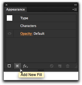
- Click once to select your text with the Selection tool, then click on the Add New Fill button in the bottom row of the Appearance Panel.

- Two new rows appear above the Characters row in the Appearance panel: one for Stroke and one for Fill. Change the Fill color to your desired background color. In my example, I’m choosing orange. Don’t be dismayed when your text changes to the new color. We aren’t finished!

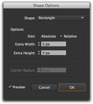
- With the Fill row still selected in the Appearance panel, chose Effects > Convert > Rectangle. Turn preview on, set your Size to Relative (important if you want your box to expand and contract as you edit the text), and then add a little bit of extra width and height. You can’t really see what you are doing yet, so rest assured you can always come back later to tweak these settings.

- Click on OK. Uh oh. Where’s the text?

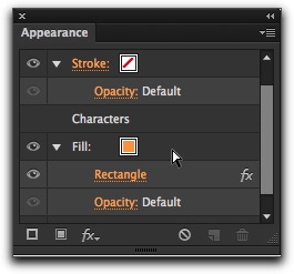
- The answer lies in your Appearance panel. Order matters, and on your screen, the Fill row appears above the Characters row. Just drag it underneath Characters, as shown below. (If you need to adjust the width and height of your rectangle, click the Rectangle link in the Appearance panel.)

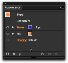
- If you decide you’d like to put a stroke around the box, just repeat steps 7–9 with the Stroke row selected in the Appearance panel.

- Pretty easy and effective, if you ask me. And don’t forget, the whole reason for doing this was so that the box would expand and contract as your edit your text. Try it!


Thank you for the information. Very much appreciated
What if the text I want to put in a box is a title inside a paragraph? Have to explain…
I have a text area (done withe the type tool) with different paragraphs, titles, subtitles (all in 1 text area). Now, I want to put in a box just the titles. But can’t, because if I select just the title (a line of my text), the add new fill tool is greyed-out. Can’t be selected. It can be selected only if I select the whole text area.
Any Idea how to resolve this?
Luka: You would have to either draw boxes behind the titles, or put the titles in their own frames. InDesign could do it even with the headings in the middle of other paragraphs, so that is a third (and in my opinion) best option.
~Barb
yes!
Thank you.