Need training at your office? Request a quote for custom training.
Adobe InDesign: Baseline Alignment Across Columns
by Barb Binder, Adobe Certified Instructor on InDesign
Updated Sep 9, 2020
Baseline alignment is a fairly easy task in InDesign. Place your multi-column story and set up the formatting for your body text, heads, lists, etc. Once you’ve made your various design decisions, it’s just a few more steps to align your baselines across columns.
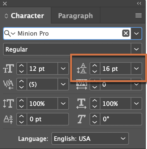
- Jot down your body text leading value. In my example, my body text is 12 point type on 16 pt leading.

- Choose Edit > Preferences > Grids (Windows) or InDesign > Preferences > Grids (Mac OS).

- In the Baseline Grid section, set Start: 0 and set Relative to: Top Margin to start your grid at the top margin.
- In the Increment Every text box, type your leading value. In my example, it’s 16 pts. This sets the grid to match my body text leading.
- Note the default View Threshold setting. It defaults to 75%.
- Click OK.
- Next, show the baseline grid with View > Grids & Guides > Show Baseline Grid.
- If you don’t see the grid right away, zoom in a bit. You have to zoom in past that threshold value you noted in step c (75% magnification) to see the grid. As you zoom out, the grid will eventually disappear so that you aren’t looking at a sea of blue lines, obscuring your text.
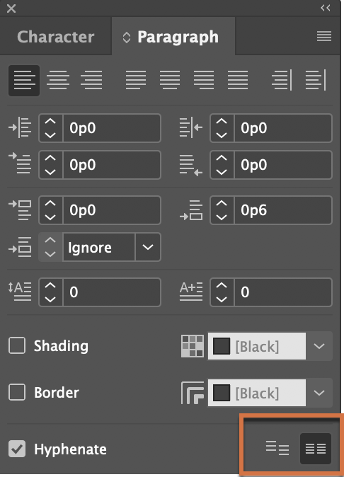
- Finally, select all of the text and align it to the grid. You can do this with Edit > Select All and then click the Align to Grid button in the Paragraph view of the Control Panel or the bottom right of the Paragraph panel.

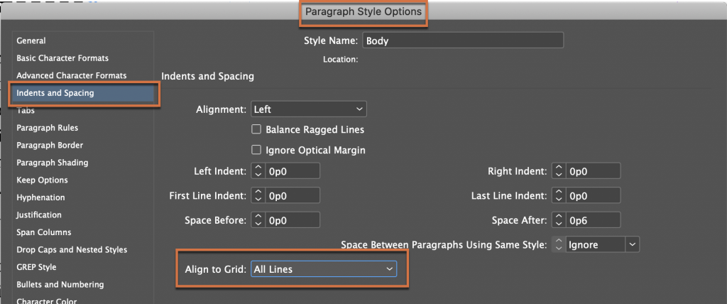
Or, since I tend to rely heavily on paragraph styles, I normally align my text to the grid via the Indents & Spacing category in the Paragraph Style Options dialog box:

Either way, the text moves up or down to snap the text’s baseline to the blue baseline grid.
As you know, most things in life involve trade-offs, and aligning text to a grid is no exception. Once you align your text to the baseline grid, you will only be able to adjust spacing before and after the paragraphs in multiples of your body text leading. In my example, that means I can have 0 paragraph spacing before/after, or 16 pts or 32 pts (16 x 2) or 48 pts (16 x 3), etc. If I want say, 6 pts above a head, and 3 pts below, I will have to take the headings off the grid.


Will you marry me? Only joking. I’ll just worship you instead. You just saved my career.
LOL
~Barb
100% agree with all of this. Thank you. SO MUCH.