Need training at your office? Request a quote for custom training.
Adobe FrameMaker: Aligning Text Across Columns, Part II of II
By Barb Binder
In Adobe Framemaker: Aligning Text across Columns, Part I of II, we looked at two of the three text alignment options: column balance and feathering. The final option is baseline alignment. It’s a great concept, but doesn’t make much sense if you don’t understand the word “baseline”. If you aren’t sure, take a quick look at this post on Basic Typography Terms.
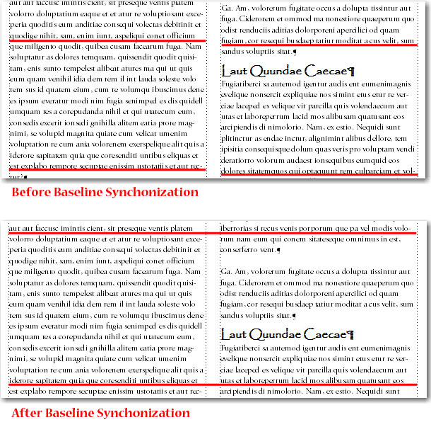
Baseline alignment means lining up the baselines across columns. Here’s how it works: when you synchronize, or align, text in a flow, FrameMaker creates an invisible grid in each text frame and aligns the baseline of the first line of each specified paragraph to the grid. FrameMaker also aligns the first line after an anchored frame and tries to align the first line in each column.
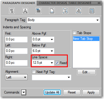
- Start by checking to see that the paragraph formats of the paragraph types you want to synchronize all have the same default font size and line spacing. Fixed line spacing needs to be turned on. In my example, my Body paragraphs have a line spacing value of 12.5 pts.

- Click in the flow you want to synchronize.
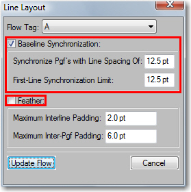
- Choose Format > Page Layout > Line Layout.
- Select Baseline Synchronization and turn off Feather.*

- In the Synchronization Pgf’s with Line Spacing of area, enter your Body paragraph leading, in my example, it’s 12.5 pts. In the First-Line Synchronization Limit text box, enter the largest font size to align at the top of a column. For example, suppose the leading for Body paragraphs is 12 points, the column grid is 12 points, and the headings are 22 points. If you want the headings to be aligned when they appear at the top of a column, specify 22 as the first-line limit. In my example, it’s also 12.5 pts.
- Click Update Flow.
- All paragraphs within the flow will snap to the 12.5 line spacing grid. Headings and other paragraph formats with line spacing values of anything other than 12.5 will not. If you want your headings, lists and other paragraph formats to also snap to the grid, you’ll need to change their line spacing values to 12.5 and activate Fixed Spacing.
*Why did we turn off feathering in step 4? Because if feathering and synchronization are both on for a flow, feathering takes precedence over synchronization. Sigh. Here’s where I remind you not to shoot the messenger. Like everything in life, it’s a balancing act. You have to pick what is most important and let the rest go. The good news is that if you have them both on, at least the first lines in the columns are synchronized with each other.


2 thoughts on “Adobe FrameMaker: Aligning Text Across Columns, Part II of II”